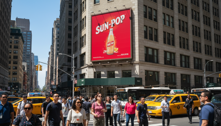
Color is far more than decoration on an outdoor advertisement—it is a strategic communication tool that shapes perception, triggers emotion, and drives consumer behavior within seconds. In the competitive landscape of out-of-home advertising, understanding color psychology has become essential for campaigns that must capture attention in cluttered visual environments where audiences have only a split-second glance to spare.
The science behind color psychology reveals that different hues activate specific psychological responses in consumers. Red, for instance, commands immediate attention and stimulates a sense of urgency, making it particularly effective for sales promotions and clearance events. The color increases heart rate and evokes feelings of excitement and energy, encouraging impulse purchases. However, red’s power comes with a caveat: during summer months when bright sunlight and natural heat already dominate outdoor spaces, warm colors like red can blend into the surrounding environment or feel overwhelming. Strategic deployment of red as an accent rather than a dominant design element maximizes its impact without creating visual fatigue.
Blue presents a contrasting psychological profile, consistently associated with trust, reliability, and calm. Tech companies and financial institutions leverage blue’s inherent stability to build consumer confidence, while the color also offers visual relief in high-heat environments. Green similarly serves specific marketing functions, evoking associations with nature, health, and tranquility. Brands focused on wellness and sustainability gravitate toward green to communicate environmental responsibility and well-being. Yellow, meanwhile, captures attention quickly and promotes optimism, though like red, it requires restraint to avoid overwhelming viewers or competing with the core message.
The effectiveness of color in outdoor advertising extends beyond emotional resonance to practical visibility considerations. High-contrast color combinations significantly enhance legibility from distance, a critical factor when audiences view advertisements from moving vehicles or while walking. Brightness and saturation levels directly impact readability, particularly in outdoor environments where natural sunlight, glare, and ambient conditions constantly shift. This is why testing colors in natural light conditions rather than solely on digital mockups proves essential—what appears vibrant on a screen may disappear into the urban or natural backdrop without proper contrast.
Real-world applications demonstrate color psychology’s tangible impact on brand performance. McDonald’s strategic combination of red and yellow exemplifies this approach: red grabs attention while yellow triggers feelings of happiness and appetite, driving consumer action. Facebook’s predominantly blue branding reinforces feelings of safety and connection, while Whole Foods’ green messaging communicates its commitment to natural and organic products. These examples reveal that successful color strategies align psychological associations with brand identity and campaign objectives.
Cultural considerations add another layer of complexity to color selection. While red universally signals urgency across many Western contexts, color associations vary significantly across cultures. White, for example, symbolizes purity in Western traditions but represents mourning in some Eastern cultures. Advertisers targeting diverse audiences must account for these cultural differences to ensure their color choices communicate intended messages rather than creating unintended associations.
Environmental context fundamentally shapes color strategy in outdoor advertising. Summer conditions present unique challenges: warm colors blend into naturally warm palettes, while cool colors stand out and provide visual relief. Conversely, the surrounding environment—whether trees, sky, or cityscape—influences which colors will effectively pop against specific backdrops. Successful billboard design requires considering not just the advertisement in isolation but its relationship to the broader visual landscape.
The interplay between color psychology and advertising effectiveness ultimately hinges on purposeful, strategic application. Color is not merely a design decision but a behavioral tool that influences mood, shapes perception, and drives consumer decisions. By understanding how specific hues trigger emotional and psychological responses, outdoor advertisers can craft campaigns that not only attract attention in crowded visual environments but also create lasting emotional connections that translate into consumer action and brand recall.

