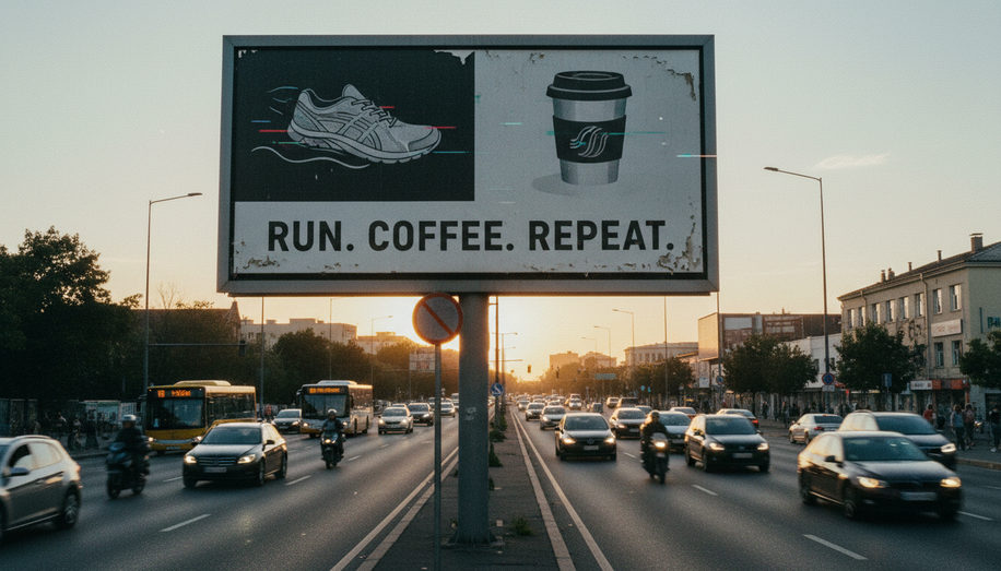
A driver traveling at 55 mph sees a billboard for only 5 to 8 seconds—sometimes less. In that fleeting window, your creative message must cut through the noise of traffic, competing signage, and the driver’s divided attention. This constraint isn’t a limitation; it’s the fundamental principle that shapes every decision in effective out-of-home (OOH) advertising for high-speed environments.
Understanding this temporal reality begins with recognizing what the human brain can process at highway speeds. At 60 mph, a driver covers roughly 528 feet in six seconds while managing traffic, checking mirrors, and navigating their route. Professional designers treat these time constraints as technical requirements, not creative preferences. Font size, color contrast, message hierarchy, and layout all serve a singular purpose: enabling instant comprehension from a distance.
The one-message rule forms the foundation of high-impact OOH design. Attempting to communicate multiple ideas dilutes the overall impact and exceeds cognitive processing capacity during these brief moments. Whether your creative centers on a headline, image, or call-to-action, focus your entire concept on a single strong takeaway. This clarity enables viewers to quickly understand and remember what they saw, even while traveling at high speeds.
Text should be limited to seven words or fewer. This brevity forces precision in messaging and ensures that every word carries weight. The constraint isn’t arbitrary—studies show that high-contrast colors alone can improve recall by 38 percent, but only when the message itself is immediately comprehensible. Attempting to convey complex information or multiple selling points guarantees failure in this medium.
Typography and contrast work together as the primary tools for legibility at distance. Bold sans-serif fonts maximize clarity, allowing the human eye to process letterforms quickly, even at highway speeds. The industry standard follows the 1:10 ratio: one inch of letter height for every 10 feet of viewing distance. At a typical highway viewing distance of 300 feet, primary messages should feature letters at least 30 inches tall, though this varies based on font weight and color contrast.
High-contrast color combinations are non-negotiable for visibility. Yellow on black provides 94 percent readability, white on dark blue achieves 89 percent effectiveness, and black on yellow reaches 87 percent visibility. The eye naturally gravitates toward contrast, making it easier for messages to stand out amid environmental clutter. Color choice also requires consideration of viewing conditions—saturated hues hold up better under changing light and weather than low-saturation options.
Imagery demands equal strategic consideration. A compelling visual can convey mood, intent, or message in an instant, sometimes better than words. When images are used, they should function as central storytelling elements rather than decorative flourishes. Creating a bold silhouette helps viewers register and remember design quickly, even from far away. The most iconic OOH visuals work in outline alone, functioning as instant visual anchors.
Visual hierarchy guides the viewer’s eye through a logical reading path. The primary message should be the largest, boldest element, with secondary information receiving smaller treatment and tertiary details potentially excluded entirely. This hierarchy prevents confusion and ensures that the most important information is processed first during those critical seconds.
Location context influences every design decision. Highway billboards at 65+ mph speeds demand maximum simplicity and contrast, while urban environments with stop-and-go traffic allow increased design complexity. Surrounding environmental factors—building colors, competing signage, typical viewing angles—determine which color combinations and visual approaches will cut through visual noise.
Testing validates assumptions before campaign launch. The five-second test remains industry standard: show your design to someone for five seconds and ask what it communicates. If they cannot articulate your message immediately, the design requires revision. This practical approach bridges the gap between creative ambition and real-world performance under high-speed conditions.
Effective OOH advertising succeeds by embracing constraints rather than fighting them. When designers treat limited viewing time as a core design principle rather than an obstacle, they create campaigns that break through the noise and deliver measurable results.

